Your cart is currently empty.
Continue shopping
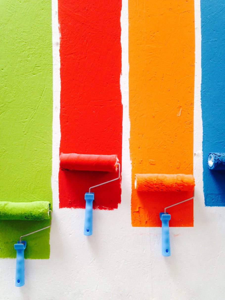
The Psychology of Color in Wall Art and Home Decor
Frequently Asked Questions
1. What is color psychology?
Color psychology is the study of how colors influence our perceptions and behaviors, triggering emotional and psychological responses.
2. How do warm colors affect a space?
Warm colors like reds, oranges, and yellows are associated with energy, enthusiasm, and warmth, encouraging social interaction and making a space feel inviting.
3. What colors are best for creating a calming atmosphere?
Cool colors like blues, greens, and purples evoke calm and serenity, making them ideal for relaxation spaces such as bedrooms.
4. How can lighting impact the perception of color in home decor?
Different types of lighting can affect how colors are perceived; natural light makes colors appear more vibrant, while artificial light can dull certain hues.
5. What should I consider when choosing wall art for my home?
When selecting wall art, consider the color wheel for visual harmony, the emotions you want to evoke, and aim for balance with your existing decor.
When it comes to decorating your home, the colors you choose play a crucial role in shaping the overall vibe of your space. Wall art and home decor can dramatically influence not just the aesthetic appeal of your environment, but also your mood, productivity, and wellbeing. Understanding the psychology of color will help you make better decisions, infusing your space with the right energy and style.
Understanding Color Psychology
Color psychology is the study of how colors influence our perceptions and behaviors. This field delves into how specific hues trigger emotional and psychological responses. It’s fascinating how something as simple as a color can evoke a range of feelings—tranquility, excitement, warmth, sadness, and more. When designing your home, it's essential to consider how colors can enhance or detract from the atmosphere you want to create.
Warm Colors: Energy and Enthusiasm
Warm colors, such as reds, oranges, and yellows, are often associated with energy, enthusiasm, and warmth. These colors encourage social interaction and can make a space feel more inviting. For example, incorporating warm hues in your wall art can create an exciting focal point in your living room or dining area.
Cool Colors: Calm and Serenity
Cool colors like blues, greens, and purples can evoke feelings of calm and serenity. These shades are ideal for spaces where relaxation is a priority, such as bedrooms or reading nooks. By choosing wall art that features these colors, you can create a soothing atmosphere that promotes peace and harmony.
Color Combinations: Creating Balance
While choosing individual colors is important, the combinations you choose can create a more complex emotional response. Here are some popular color combinations and their psychological effects:
- Blue and Yellow: This combination brings a sense of tranquility paired with positivity, making it ideal for spaces suited for work and creativity.
- Green and White: A refreshing palette that symbolizes growth and renewal. Perfect for kitchens or home offices.
- Pink and Grey: The warmth of pink added to the calming qualities of grey creates a romantic and sophisticated look suitable for bedrooms.
Using Color to Define Spaces
Different rooms serve different purposes, and the colors you choose can reinforce their functions. For instance, in a home office, shades of blue can enhance focus, while a cozy nook might benefit from warm oranges to inspire creativity. Here are some suggestions for colors by room:
Living Room
Try warm, inviting colors like soft yellows or earthy tones. Incorporating wall art with these colors can create a welcoming atmosphere for entertaining and relaxation.
Bedroom
Cool colors like blue, green, or muted purples are perfect for promoting rest. Look for wall art that complements these hues to enhance tranquility.
Kitchen
Bright, energetic colors can increase appetite and cheerfulness. Consider vibrant wall art that includes bold reds or yellows to create an invigorating environment.
The Impact of Light on Color Perception
Another crucial factor to consider is how different types of lighting can affect the way colors are perceived in your home decor. Natural light can make colors appear more vibrant, while artificial lighting may dull certain hues. It's essential to experiment with how your chosen wall art looks under various conditions before making a final decision.
Natural vs. Artificial Light
Natural light is the best friend of vibrant colors, as it helps them pop and appear lively. In contrast, incandescent lights may give your colors a warm tone, while fluorescent lights might create a cooler effect. Always assess how the colors in your wall art react with the lighting in the room to ensure your space reflects the mood you want to create.
Choosing the Right Wall Art for Your Colors
Selecting wall art that aligns with your color scheme involves more than just choosing pieces you find visually appealing. You should also consider how those pieces resonate with the emotions you want to evoke. Here are some tips for selecting wall art that complements your decor:
- Consider the Color Wheel: Use complementary or analogous colors from the color wheel to create visual harmony.
- Focus on Emotion: Think about the feelings you want to inspire. Look for artwork that resonates with those emotions.
- Balance is Key: If your decor is bold and colorful, consider more neutral wall art to prevent overwhelming the space.
Framing and Placement
Framing options and placement also greatly affect how colors are perceived. A bold piece with a neutral frame may draw focus to the art without overpowering the decor. Meanwhile, placing art at eye level creates an inviting and engaging experience.
Color Trends in Home Decor
Staying informed about current color trends can help you make eye-catching choices that resonate with modern styles. In recent years, we’ve seen a rise in the popularity of natural hues—such as earthy greens and soft browns—symbolizing a return to nature.
Organic Colors
As people become more environmentally conscious, organic, earthy tones are increasingly favored within home decor. These colors evoke a sense of calm and tranquility and can help create a refreshing indoor atmosphere.
Bold and Bright Colors
On the flip side, bold and vibrant colors remain in style, particularly for accent walls and statement pieces. These colors can energize a room and add a unique touch of personality to your decor.
Cultural and Emotional Significance of Colors
Colors don’t just hold universal meanings; they also carry cultural significance that can affect how they are perceived. Understanding these nuances will help you choose colors that resonate better with your personal experiences and those of your guests.
Red: Passion vs. Danger
In many cultures, red symbolizes love, passion, and warmth. However, it can also connote danger or urgency. Depending on the context, using red in your wall art can convey comfort or provoke excitement.
Blue: Trust and Calm
Blue is often linked to trust, loyalty, and calm. It’s a popular choice for spaces meant for relaxation or concentration. Depending on the shade, you can create various atmospheres; lighter blues evoke serenity, while deeper blues may lead more towards professionalism.
The Importance of Personal Expression
Ultimately, the colors you choose for your wall art and home decor should reflect your personal style and preferences. The psychological aspects of color can guide your decisions, but what matters most is what resonates with you. Don’t hesitate to mix and match colors, styles, and themes until you create a home that genuinely feels like you.
Getting Inspired
Find inspiration by exploring various interior design magazines, websites, and platforms like Pinterest. These resources can offer a plethora of ideas on how to experiment with colors and styles that resonate with you.
Transform Your Space with Color
Understanding the psychology of color in wall art and home decor truly empowers you to transform your living space. By thoughtfully selecting colors, you can enhance your home's atmosphere, reflecting your style and emotional desires. Remember, your space should be a harmonious blend of aesthetics and wellbeing, making it a true sanctuary for you and your loved ones. So go ahead, let these color insights guide you in creating a vibrant, welcoming, and beautiful home!